This case study has been reconstructed using modified layouts, sample content, and fictional data to protect confidential information. The designs shown represent the workflow problems, interaction concepts, and design thinking I contributed to rather than original production screens.
Users needed more information, not less.
The platform supported complex government workflows where users needed to reference multiple pieces of information while completing a task. The challenge was that those pieces of information often lived in different sections of the system. Users could potentially move between records, pages, or system areas simply to gather the context required to make one decision. That created three major UX problems:
TOO MUCH
CONTEXT
Moving between different screens interrupted the user's workflow and made it easier to lose track of where they were.
SEPERATION OF
INFORMATION
Information that needed to be compared or reviewed together was not always visible at the same time.
COMPLEX
WORKFLOW
The underlying workflow was inherently information-heavy. Hiding too much information would make the experience less useful rather than simpler.
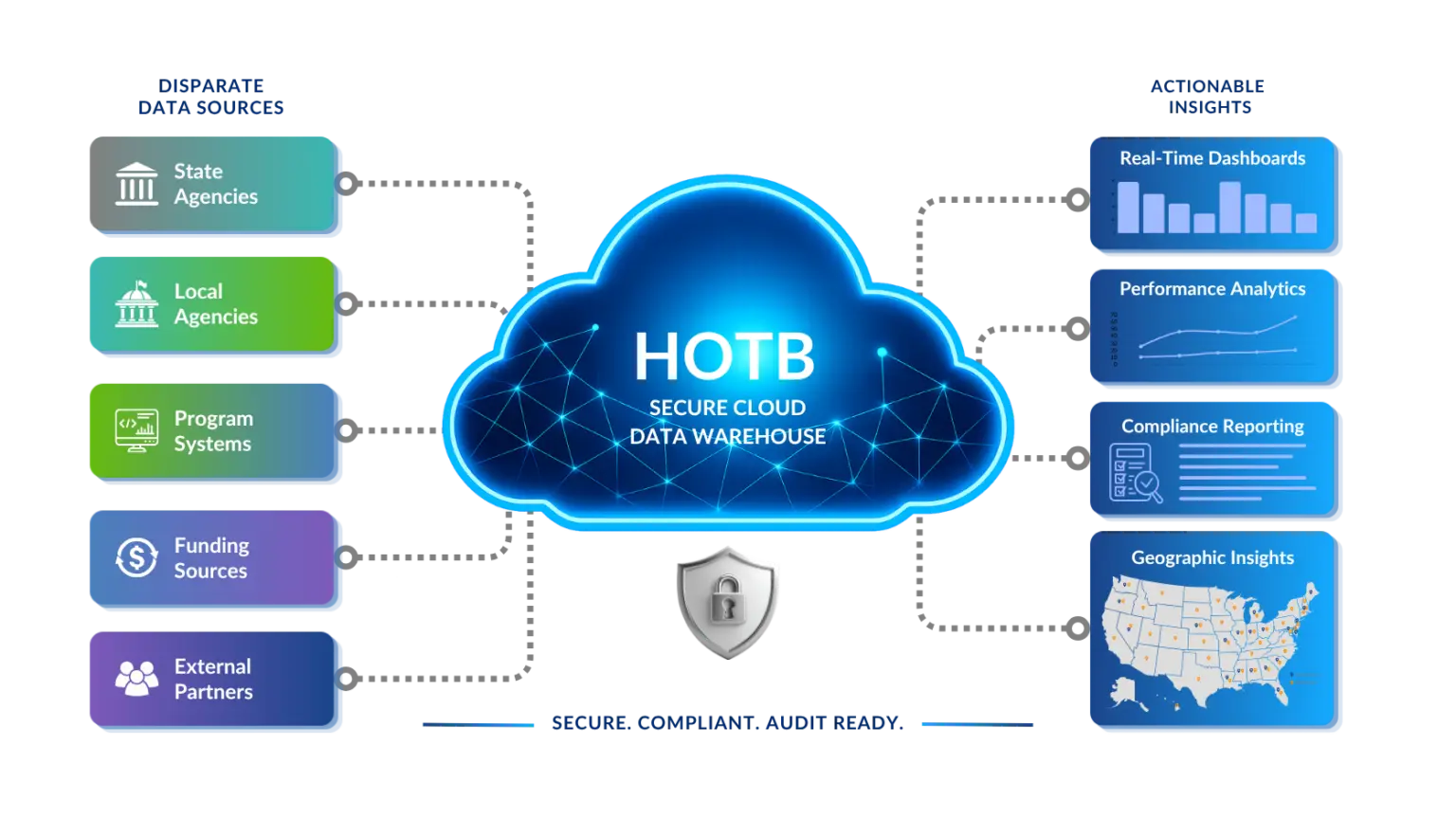
01. PRESERVE CONTEXT
Keep the primary
task visible.
The experience keeps the main workflow visible while supporting information appears alongside it.
02. REDUCE SWITCHING
Bring information
to the user.
Related records and supporting details can be reviewed without leaving the current workflow.
03. CREATE FLEXIBILITY
Support different workflows with one pattern.
Consistent controls and layout patterns help users stay oriented across changing workflows.
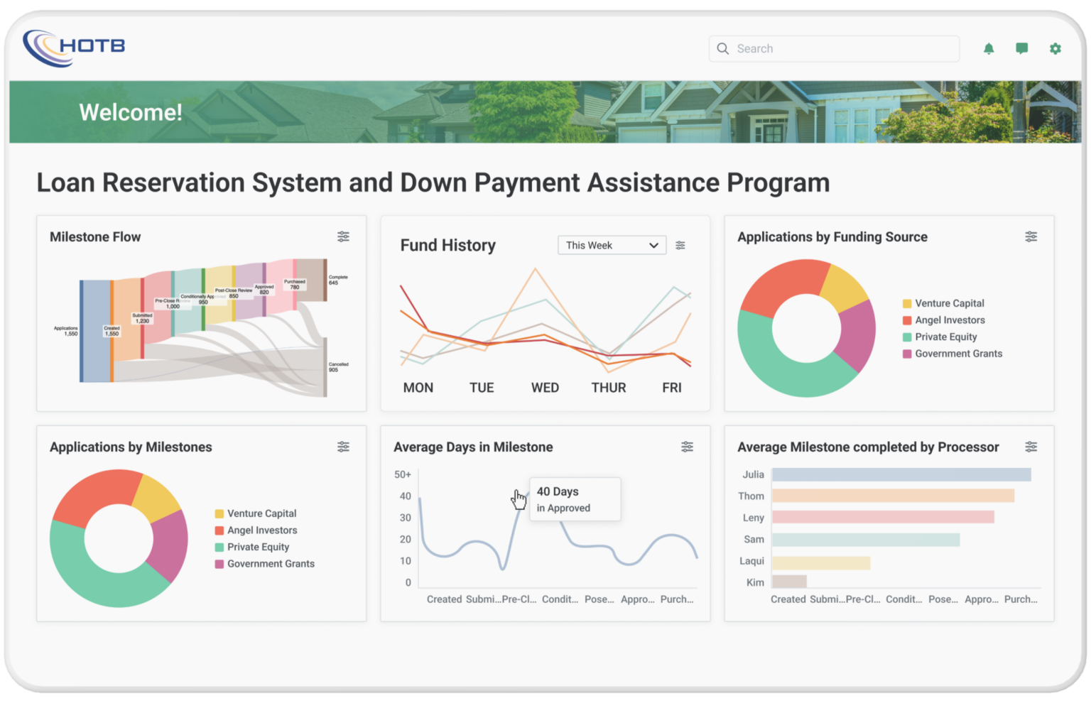
One pattern, multiple workflows.
One of the most important considerations was avoiding a solution that worked for only one specific use case. The interaction needed to support different combinations of information depending on the user's task.
Rather than designing a unique layout for every workflow, the split-screen model created a reusable framework where the primary and supporting content could change while the underlying interaction remained familiar.
That made the solution more scalable across the platform.
The design also needed to account for technical constraints and implementation behavior.
I communicated the intended experience through:
• Wireframes
• Interaction states
• High-fidelity designs
• Reusable UI patterns
• Design recommendations
• Developer collaboration and feedback
The goal was to make both the visual design and the expected behavior clear enough for implementation discussions.
Do not add anything here about specific engineering decisions unless you genuinely remember them.
Because you don't have validated production metrics, I would not invent numbers.Instead:
LESS
CONTEXT
SWITCHING
Supporting information could remain accessible without constantly leaving the primary task.
BETTER
INFORMATION
VISIBILITY
Related information could be reviewed together when the workflow required comparison or additional context.
MORE
FLEXIBLE
WORKFLOWS
The interaction model could support different record and information combinations rather than one fixed scenario.
SCALABLE
UI
PATTERN
The underlying split-screen behavior could be reused across multiple workflows while maintaining consistent interaction patterns.
Simplicity doesn't always mean showing less.
One of my biggest takeaways from this project was that complex enterprise products cannot always be simplified by removing information. Sometimes the information is necessary. The design challenge is creating enough structure that users can work with that complexity confidently.
This project strengthened how I think about information hierarchy, context, and interaction patterns in enterprise software. Instead of asking how much information I could remove, I learned to ask:
What does the user need to keep in context to complete the task successfully?
That question ultimately shaped the direction of the experience.