PRODUCT DESIGN · ENTERPRISE UX
Down Payment Assistance Program
A split-screen workflow designed to reduce context switching and keep critical application information accessible in one workspace.
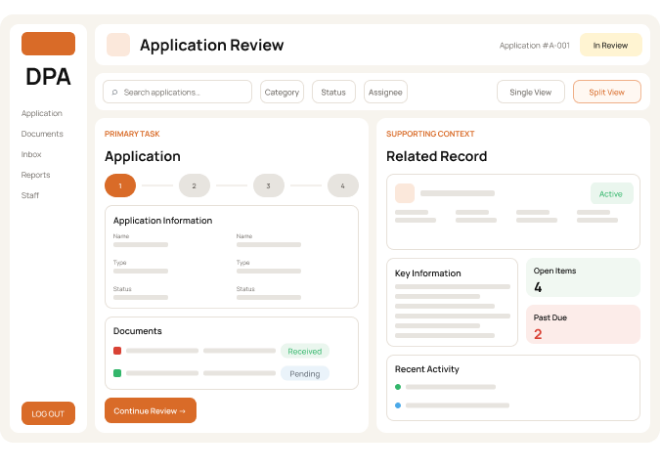
RECONSTRUCTED CASE STUDY
Original product screens have been recreated to protect confidential information while representing the workflow and interaction concepts I contributed to.
01 · OVERVIEW
Keeping related information visible during review.
Staff needed to review records, program details, and supporting information without repeatedly leaving the task they were working on.
02 · THE CHALLENGE
Users needed more context without losing their place.
Page switching made review and comparison slower and harder to follow.

Context switching
Supporting documents lived outside the user's current task.

Fragmented visibility
Related records were difficult to review together.

Necessary complexity
The information could not simply be removed or hidden.
04 · RECONSTRUCTED DESIGN ARTIFACTS
Recreated artifacts showing the interaction model.
RECREATED SAMPLE · NOT PRODUCTION UI
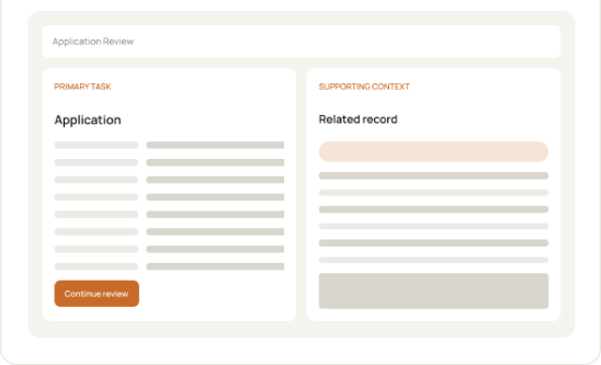
Low-fidelity wireframe
A simplified workspace exploration used to test how persistent context and supporting information could coexist.

RECREATED SAMPLE · NOT PRODUCTION UI
Rough split-screen UI
A mid-fidelity sample showing the proposed relationship between a primary task and supporting context.
RECREATED SAMPLE · NOT PRODUCTION UI
Workflow flow chart
A recreated flow showing where contextual information enters the review process.
01
Open application
Primary task begins
→
02
Review core details
User scans key information
→
03
Need more context?
Supporting info is required
→
04
Open secondary view
Related record stays alongside task
→
05
Return & complete
User finishes without losing place
03 · DESIGN PROCESS
I explored ways to bring supporting information into the current task.
01
Define the information relationship
Identify which information needed to remain visible together during review.
02
Explore layout models
Compare full-page navigation, overlays, and side-by-side approaches.
03
Refine the interaction
Define predictable open, switch, close, and return behaviors.
04
Align with constraints
Validate the direction against stakeholder and implementation constraints.
05 · FINAL SOLUTION
A split-screen workspace that keeps the task in context.
Supporting records open beside the primary task, giving users the context they need without forcing another page.

Persistent context
The original task stays visible while users reference supporting information.

Flexible secondary view
Different records can appear within the same interaction pattern.

Predictable behavior
Consistent open, switch, and close behavior keeps users oriented.
06 · REFLECTION
Simplicity does not always mean showing less.
In information-heavy products, simplicity comes from structure. This project strengthened how I think about context, hierarchy, and reusable interaction patterns.