CASE STUDY · BRAND IDENTITY · DIGITAL EXPERIENCE
Sunshine Studio

STATIONERY SYSTEM
One identity, multiple print moods.
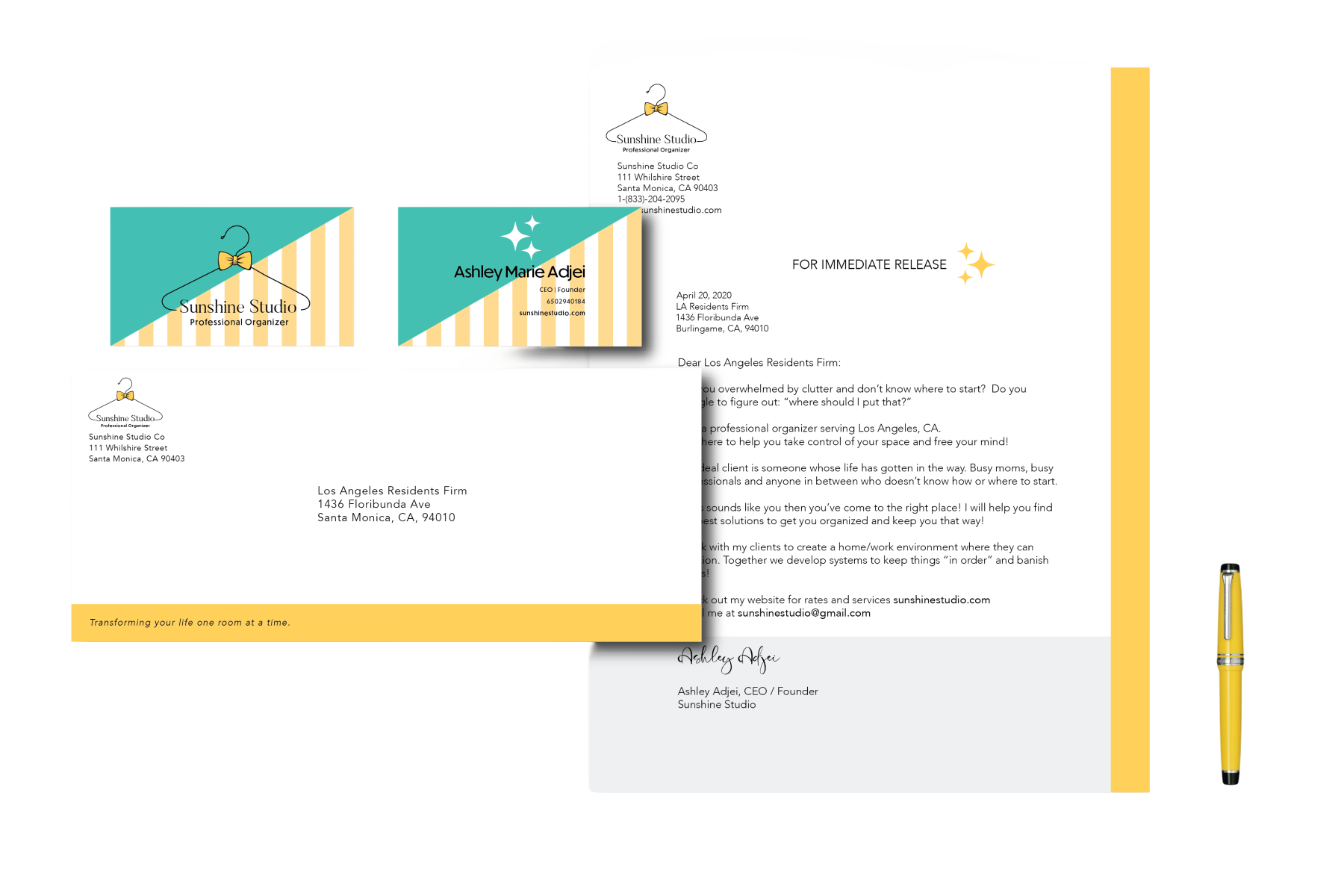
The system was designed to work across formal correspondence and more expressive brand moments without losing recognition. The pink and golden-yellow applications create variety while keeping the same typography and structure.
PRINT COLLATERAL
Built to feel cohesive in real-world use.
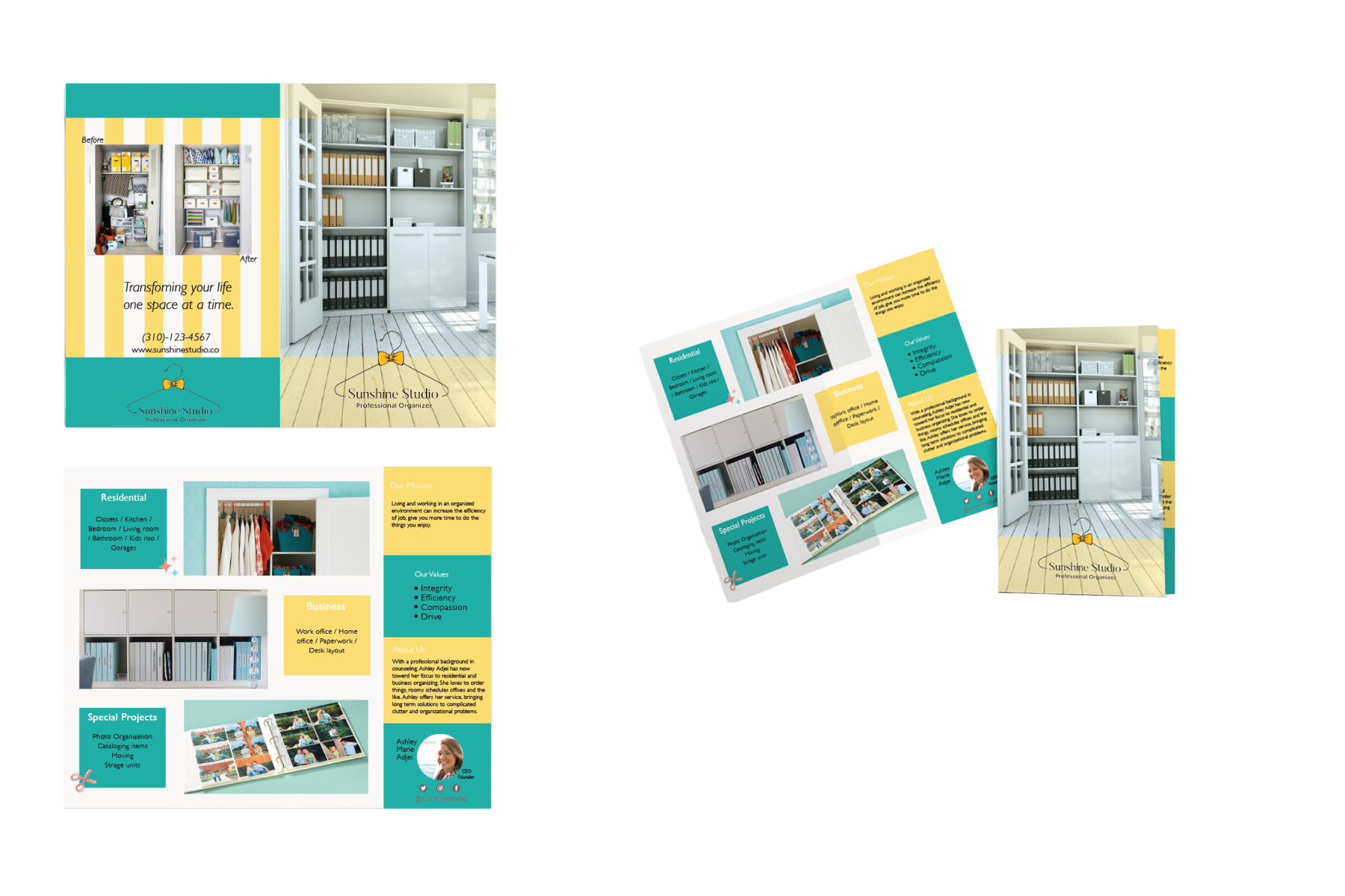
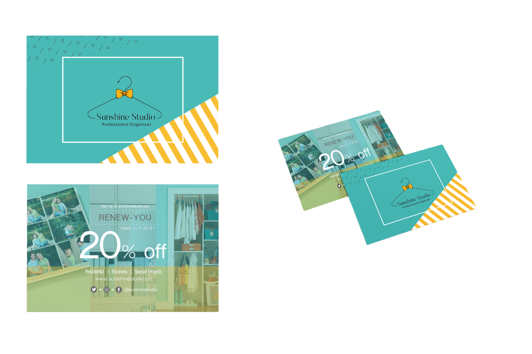
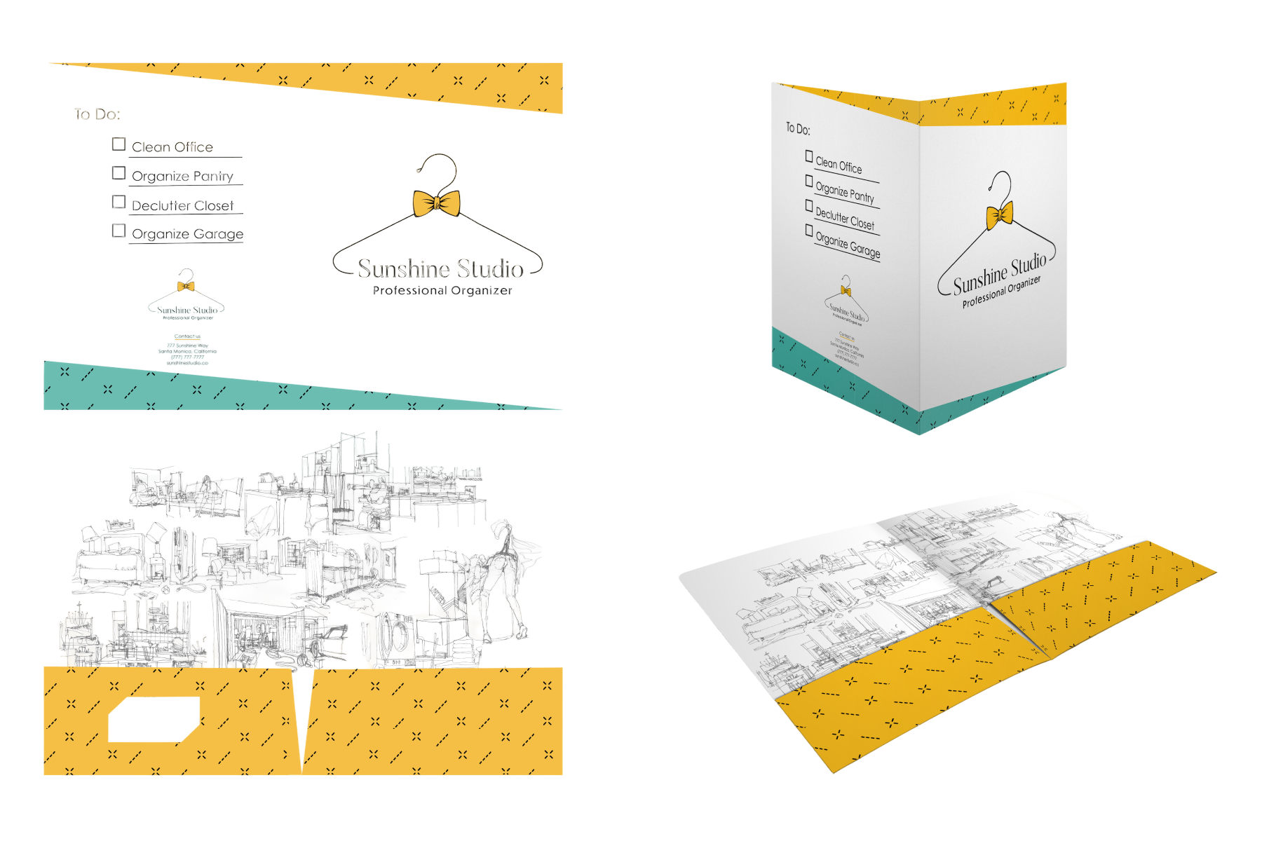
Folder systems, business cards, and letterhead were treated as one family rather than isolated deliverables. Repetition in shape, color, and typography makes the identity recognizable without relying on decoration.
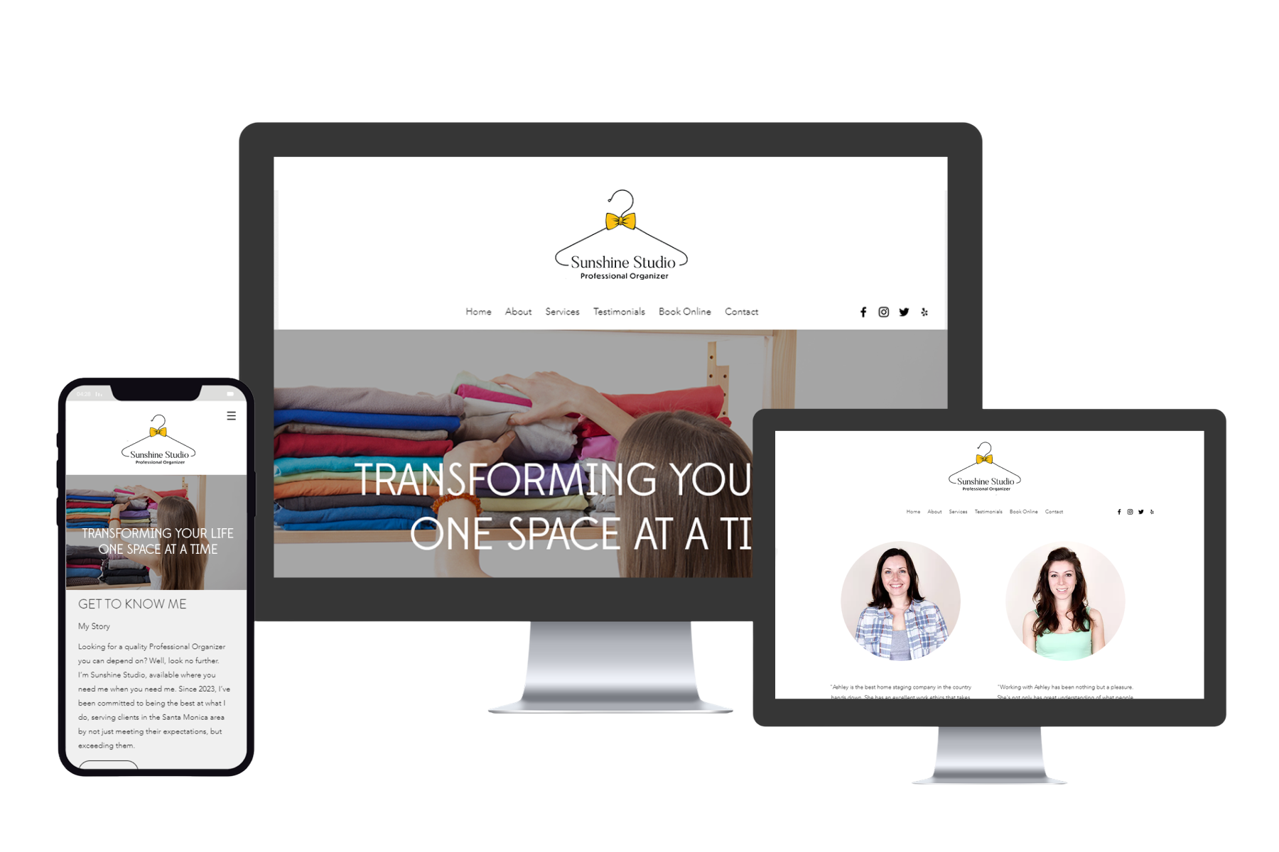
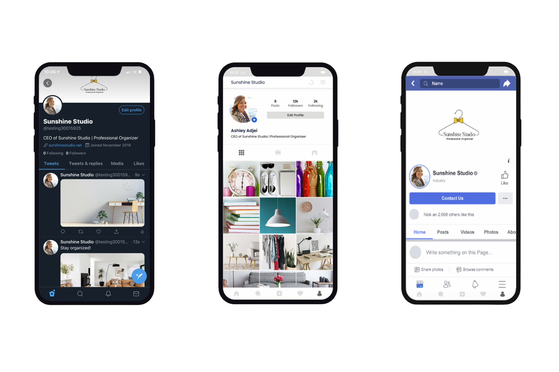
BRAND IN THE WORLD
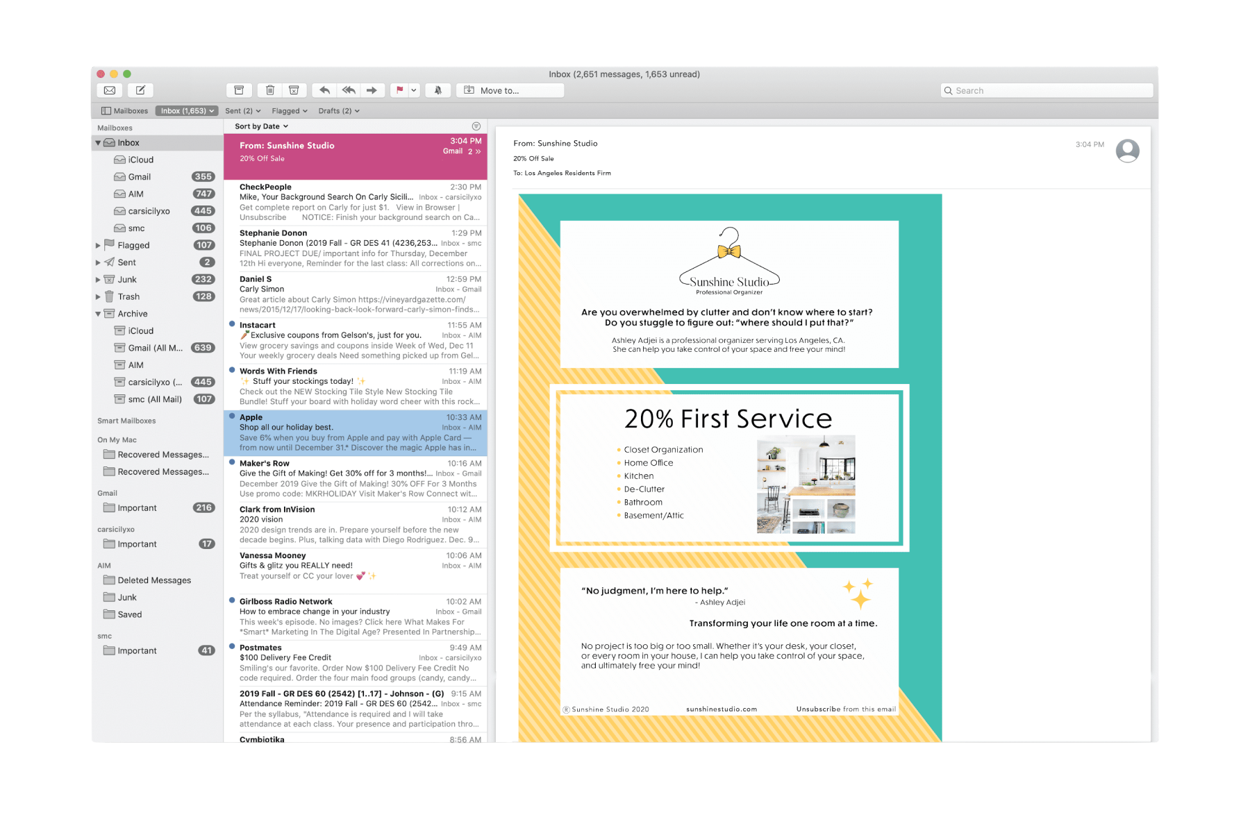
From identity system to everyday touchpoints.


REFLECTION
A brand system should feel recognizable without making every application look the same.
Sunshine Studio works best when the identity is treated as a flexible system rather than a single look. The logo, palette, typography, and layout rules create enough consistency that print, packaging, and digital applications can vary while still feeling related.